
Stephen Denny tells us how Bringing Un-Sexy Back is good for your marketing. I think the same principle also goes for your website. This is one area where small businesses can actually get a good lesson from a big business (website). Like we did with our logo lesson (see: The Importance of a Logo in Branding), let’s analyze some of the most popular websites in the world and see what we can learn for your website.
Update: This article was originally written in November 2007. As of August 2014, the top four traffic websites in the world are: #1-Google, #2-Facebook, #3-YouTube, #4-Yahoo. That order has remained static for several years.
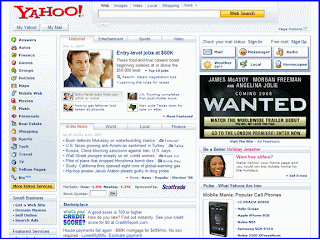
Yahoo is was the most visited website in the world. According to Alexa, during the last three months an average of 27% of all Internet users visit Yahoo during a day. Wow!
Look at Yahoo’s screen shot above. What’s their secret? (It’s also pretty amazing how little that home page has changed in 7 years)
What stands out in their design? There seems to be a lot of different things you can do with the website, but it sure ain’t pretty.

Google is the second most popular website on the Internet. A full 25% of Internet users visit Google every day. (that figure is now 40%!)
Let’s look at their screen shot see if we can discover their magic formula. Hmmm, there’s no “About” page. There’s no flash intro for us to skip. Where are all the cool graphics? (And yes, seven years later that home page looks almost exactly the same) And what about all that white space? Shouldn’t we put a bunch of copy or pictures there to fill that up? That’s just wasted space.
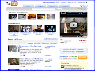
YouTube is the third most popular website on the planet and its share of Internet users has increased 30% in the past three months. I wonder why?
With the exception of the cheesy pumpkin in the logo for Halloween, there’s not much effort in the prettiness of the design.
What are they crazy? Look at all those video windows just scattered around the screen. Who would want that design?
What do all these sites have in common? Minimal design, maximum function.
Whenever you hire a web designer to do your website, one of their first requests is for inspiration. They will want you to surf the internet and tell them some websites you like so that they can copy the design.
That’s because designers think the design is most important. It’s not. What people can do with your website is most important. So when your website designer asks you for inspiration, just say “Yahoo, Google, & YouTube.”
Here’s the lesson when you are building your website: Don’t spend a bunch of money on a pretty design. Instead go with un-sexiness. Maximize the experience on your website and minimize the design.
Update August 2014: The importance of purpose over website sexiness is reinforced in this podcast episode on refreshing your home page to capture new customers. Improving Your Home Page Experience
Don’t miss out on free marketing advice. For updates on new articles: Receive The Marketing Spot by Email or Get The Marketing Spot in a blog reader.